INDEPENDENT CONCEPT REDESIGN
Reimagining Mobile Ordering for 85°C Bakery Cafe
A self-initiated redesign concept that transforms the existing 85°C Bakery app into a clearer mobile ordering experience from store selection to checkout.
Project Details
ROLE
UX/UI Designer
SCOPE
UX Research, User Flows, UI Design, Prototyping
PLATFORM
iOS Mobile App
TYPE
Mobile App Redesign
PROJECT CONTEXT
Creating a more connected ordering experience
85°C Bakery Cafe is an international bakery and beverage chain known for its freshly baked pastries, cakes, and handcrafted drinks. At the time of this project, its mobile experience presented an opportunity to make product discovery and ordering more intuitive.
BEFORE — ORIGINAL 85°C APP
Understanding the existing experience
I reviewed the existing app to identify opportunities for creating a clearer, more connected customer journey.

01 — Splash
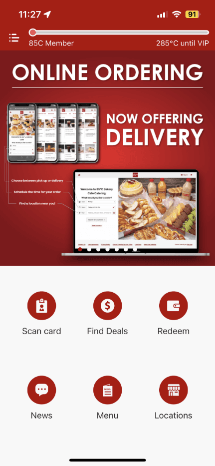
02 — Home
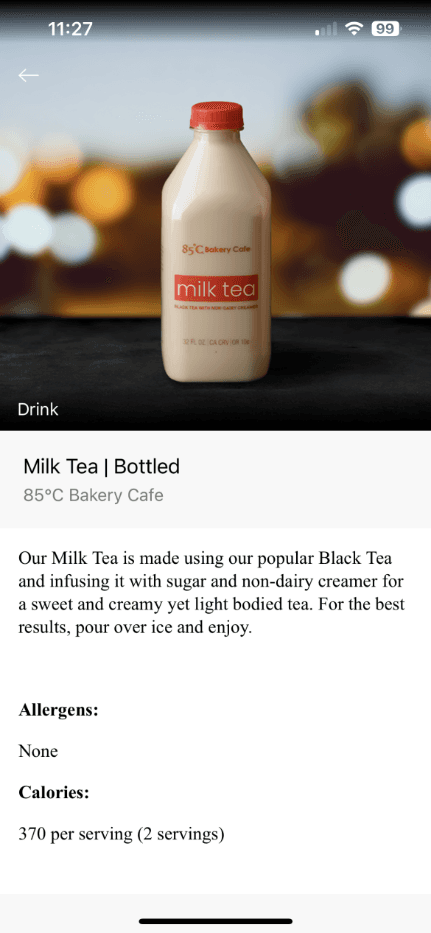
03 — PRODUCT DETAILS
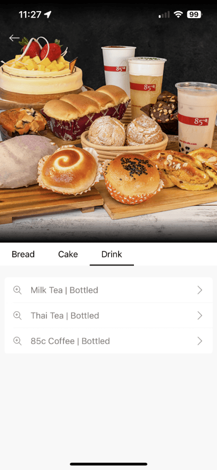
04 — MENU LIST
Where the experience fell short
01 — UNCLEAR ORDERING ENTRY POINT
Online ordering was presented alongside several equally weighted actions, making the primary ordering path difficult to identify.
02 — LIMITED PRODUCT DISCOVERY
Text-heavy menu lists made products difficult to browse and compare.
03 — DISCONNECTED CUSTOMER JOURNEY
Store selection, product browsing, and ordering did not feel like one continuous flow.
THE OPPORTUNITY
How might we make mobile ordering feel clear, visual, and connected?
The redesign focused on helping customers confidently select a store, discover products, and complete an order within one continuous journey.
BEFORE / AFTER
From scattered features to a connected ordering journey
I reorganized the experience around the customer’s primary task: selecting a store, browsing products, and completing an order in one continuous flow.
COMPARISON 01 — Home and ordering entry
BEFORE — ORIGINAL APP

AFTER — MY REDESIGN
COMPARISON 02 — Menu browsing
BEFORE — ORIGINAL APP

COMPARISON 03 — Product details
BEFORE — ORIGINAL APP

The process
Turning insights into a clearer ordering journey
After identifying key usability opportunities in the existing app, I used experience review, user flows, wireframes, and prototyping to shape a clearer and more connected mobile ordering experience.
Process overview
From experience review to prototype
01
Experience Review
Reviewed the existing mobile experience to identify friction in product discovery, ordering, and checkout.
02
Journey Mapping
Mapped the existing ordering journey to identify friction points, key decisions, and disconnected steps.
03
Wireframes
Explored layouts for navigation, browsing, cart review, and checkout flow.
04
Prototype
Built an interactive mobile prototype to demonstrate and refine the redesigned ordering flow.
Discover
Evaluating the existing experience
I reviewed the existing app from a customer’s perspective, focusing on how easily users could discover products, understand ordering options, and move through checkout. This review helped identify opportunities to create a clearer and more connected ordering journey.
DESIGN PRIORITY
PRODUCT CLARITY
Make product imagery, descriptions, and pricing easier to understand.
DESIGN PRIORITY
ORDERING CONFIDENCE
Clarify store selection, fulfillment options, and product availability.
DESIGN PRIORITY
CHECKOUT SIMPLICITY
Create a continuous and familiar path from cart to checkout.
USER FLOW
Simplifying the path from discovery to checkout
I moved fulfillment and store selection earlier in the journey so customers could browse relevant products and availability before adding items to their cart.
Choose fulfillment
Select store
Browse menu
View product
Add to cart
Checkout
Order confirmation
Turning design priorities into interface decisions
01 — START WITH CONTEXT
Problem: The relationship between store selection, fulfillment, and product availability was not immediately clear.
Decision: Move store and fulfillment selection earlier in the journey.
02 — MAKE BROWSING VISUAL
Problem: Text-heavy menu lists made products difficult to scan and compare.
Decision: Use product imagery, categories, descriptions, and pricing to improve discovery.
03 — KEEP CHECKOUT CONTINUOUS
Problem: Cart review, reward information, and checkout felt like separate parts of the ordering journey.
Decision: Connect cart review, rewards, and checkout within one continuous flow.

Structuring the ordering experience
SCREEN FLOW
FINAL DESIGN
A clearer mobile ordering journey
01. START AN ORDER
A focused entry point makes mobile ordering easy to begin.
02. BROWSE THE MENU
Visual categories make products easier to discover and compare.
03 . REVIEW PRODUCT DETAILS
Clear product information supports confident purchase decisions.

04 . COMPLETE THE ORDER
A connected cart and checkout flow keeps ordering continuous and familiar.
HIGH-FIDELITY MOCKUPS
The complete ordering experience

PROTOTYPE
Experience the redesigned journey
Interactive prototype materials are preserved in the project files for reviewing the redesigned ordering journey.
VIEW INTERACTIVE PROTOTYPE
REFLECTION
What I learned
This project strengthened my ability to connect research findings with information architecture, user flows, and interface decisions. If I continued the project, I would validate the redesigned ordering journey through usability testing and refine it based on observed customer behavior.